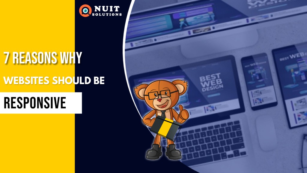
7 reasons why websites should be responsive

5 Reasons why E-commerce will bring you better sales
May 28, 2021
5 important ways to keep your website secure
June 22, 2021
According to facts, there are 5.22 billion unique mobile phone users in the world in 2021.. We have experienced that mobile phones and tablets are capable of performing more tasks than a desktop. Taking advantage of this new reality internet surfing, social media, emails, online shopping, banking and even education, is being taken over by mobile.
But is it really possible to build a website in such a way that it could be seen from different screen sizes, yet look absolutely professional? Yes, it is definitely possible! This method is known as the Responsive Web Design. In simple words, Responsive Web Design means that the web page adjusts to the screen size, depending on which device it is being displayed on, thus being user-friendly, which ultimately is the most important aspect for any website or blog.
But why responsive? Here are 7 main reasons why websites should be responsive.
1. GETS YOU IN GOOGLE FAVOURITES LIST

This basically means that a responsive website is recommended by Google. Google being the primary search engine, has a single minded focus. Google takes into consideration all website responsiveness using which it determines and ranks the website in the search engine results. Surely SEO is very important, and for that case your website needs to be responsive!
2. SINGLE WEBSITE, MANY DEVICES

In today's Uber mobile world, the most appealing and critical aspect of the responsive website is to provide a great user- experience across multiple devices and screen sizes. A website will look great no matter what screen size it is viewed on; whether it was yesterday’s desktops and laptops, or today's mobiles and tablets, or tomorrow’s smartwatches and Google Glass, or whatever new drive is invented for surfing the internet. You will not need to upgrade your website, because your responsive web design and development will work for them too.
3. EASIER TO MANAGE
There are numerous advantages of responsiveness of the website and easy manageability is one of them. For online businesses, it becomes difficult to oversee separate desktop and mobile websites. SEO campaigns and Google ADwords need to be managed for every site type. Having a website that works well on all screen types, content and images have to be uploaded just once which saves time as well as efforts.
4. COST-EFFECTIVE

A complicated, well designed, professional- looking, responsive website could be expensive to develop, but it might still be cheaper than having a number of websites for a number of different screen sizes. Yet after the website goes live, maintenance of a website is a task. Having a responsive website makes it easier and economical to take care of your website and update it regularly. You will agree that it is much easier to maintain one website rather than multiple sites.
5. KEEP A TRACK OF WHO VISITS YOUR WEBSITE
More than half the population in the world uses social media through their mobile phones. The advantage of having a responsive web design is that it becomes an online asset, using which, you can see who visits the website and improve your targeting. Having one single website makes it easier to track analytics. You can even share links from social media platforms like Facebook, YouTube, Instagram, Twitter, etc. on your website, to engage more audience and thus increase traffic. So if you have some social media strategy; get responsive!
6. LOADS FASTER

Responsive websites have stacking time of approximately 3 seconds which is lower than other websites. According to facts, people abandon those websites that take more than 4 seconds to finish loading content. The quicker the website loads, the more the people will engage and browse through your website. It also puts a limit to users' experience, where a responsive website comes into the picture. It has a direct positive impact on the duration of website visitors.
7. HIGHER CONVERSION RATES

According to facts, smartphone conversion rates are about 64% higher than desktop conversion rates. As your visitor spends more time on your website, there is an increase in the trust factor which in turn gets you a new customer. Even if your website looks professional with appropriate colors on a desktop but does not perform great on your mobile phone then there are high risks of not getting conversions. It is challenging to work only on a desktop site. Google might interpret that the website is irrelevant and indirectly drop your rankings, which is why a responsive site will not compromise on the content.
KEY TAKEAWAY: Responsive web design means making your customers happy!
I hope this article has helped you and has made you feel confident and sure about why websites should be responsive. It's not only the trend, it's the need of the hour. With a responsive website, proper planning and execution, you can give your audience accessibility in any kind of device. Whether you have a website or planning to build one, make sure it is definitely responsive!
Contact us if you feel that it is the right time to get started!
Related posts


