3 Essential Features for Building a Mobile-First Website

7 reasons why Digital Presence is imperative for businesses
September 28, 2024
6 reasons why Website Blogs are a great SEO Strategy
March 1, 2025
In an era where mobile devices reign supreme, creating a mobile-first website isn’t just a trend—it’s a necessity. With over 50% of all internet traffic coming from mobile devices, the need to create websites that load and can be used easily on smartphones and tablets has never been more prevalent. Let’s dive into three essential features that will help you build a website tailored specifically to mobile users. These features will enhance usability, improve loading times, and create a seamless browsing experience.
1. RESPONSIVE DESIGN
As we have seen, it’s a fundamental principle that any site designed for mobile first should be responsive. This approach makes it possible for your website to meet the current display standards and provide an excellent experience for all users regardless of the devices used in accessing your website. Responsive design makes use of CSS media queries that allow you to change content, images, and layout depending on the specific device that is being used.
One of the most profound benefits associated with responsive design is that it makes site development and management a lot easier. Instead of building another set of sites specifically for desktop and mobile users, a single responsive site manages all the needs effectively. In addition, it improves the Google search engine rank as Google prefers websites, which are developed using responsive architecture. Since organic searches are an essential element of traffic generation, an easy-to-navigate site structure that easily loads on a mobile device becomes a must.

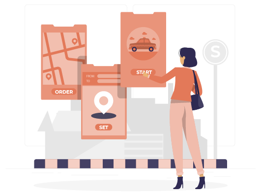
2. INTUITIVE NAVIGATION
Speed is crucial, particularly in mobile browsing. Studies indicate that users tend to abandon websites that take longer than three seconds to load. To keep mobile users engaged, consider implementing the following strategies to ensure quick loading times:
Optimize images: Oversized images can significantly slow down load times. Utilize formats like WebP and compress images to enhance speed without sacrificing quality.
Minify CSS and JavaScript: Decreasing the size of your CSS and JavaScript files by eliminating unnecessary spaces and comments can improve loading performance.
Leverage browser caching: This technique allows frequently accessed resources to be stored locally on a user’s device, eliminating the need for them to be downloaded each time a visitor accesses the site.
Ultimately, a well-designed navigation structure can greatly influence user retention and conversion rates.
3. FAST LOADING TIMES
Mobile users exhibit distinct browsing habits compared to those on desktops, which makes seamless navigation essential for mobile-first websites. The main objective is to help users locate what they need with just a few taps. Here are some practical approaches to achieve this:
Thumb-friendly buttons: Ensure buttons and clickable elements are sufficiently large for easy tapping. A good guideline is to make buttons at least 44×44 pixels in size.
Streamlined menu designs: Use hamburger menus to conserve space while providing access to all site pages. Make sure these menus are easy to locate and navigate.
Search functionality: Adding a visible search bar allows users to swiftly find specific content, products, or services without the need to scroll excessively through pages.

KEY TAKEAWAY: By focusing on responsive design, fast loading times, and user-friendly navigation, businesses can enhance their website for an optimized browsing experience!
Creating a mobile-first website is a strategic approach to meet the needs of today’s consumers. the mobile user experience. As mobile traffic continues to rise, implementing these features will improve both website performance and search engine optimization.
For expert guidance in building a mobile-first website, partner with NUIT Solutions – your trusted ally in creating stunning and user-friendly online experiences.
Related posts


